Black and White Prints: How to Choose, Frame, and Style Them
Adding black and white prints to your home is one of the fastest ways to sharpen a room’s visual identity. The contrast of dark and light tones cuts through clutter and brings a calm, focused energy that color art sometimes can’t match. Whether you’re drawn to architectural shots, abstract forms, or nature close-ups, black and white artwork gives any wall instant clarity.
You don’t need a large budget or a design degree to make it work. Knowing a few key rules about scale, framing, and placement will help you turn a single black and white art print into a statement piece or build a gallery wall that looks intentional rather than random.
Picking the Right Image and Print Size
Start with subject matter that holds meaning for you. A landscape print works in a living room or hallway; a portrait or figure study suits a bedroom or study. Black and white art prints in abstract patterns can go almost anywhere because the tonal contrast does the visual work regardless of furniture style.
Size matters more than most people expect. A print smaller than 16×20 inches tends to disappear on a wall above a sofa or a bed. For large walls, consider a single oversized piece at 24×36 or larger. For smaller spaces or gallery clusters, a mix of 8×10 and 11×14 sizes keeps things lively without overwhelming the eye.
Pay attention to paper finish. Matte paper reduces glare and reads as more gallery-like; glossy paper lifts the highlights and adds punch to high-contrast shots. If you’re printing at home, choose a heavyweight coated stock of at least 230 gsm for best results.
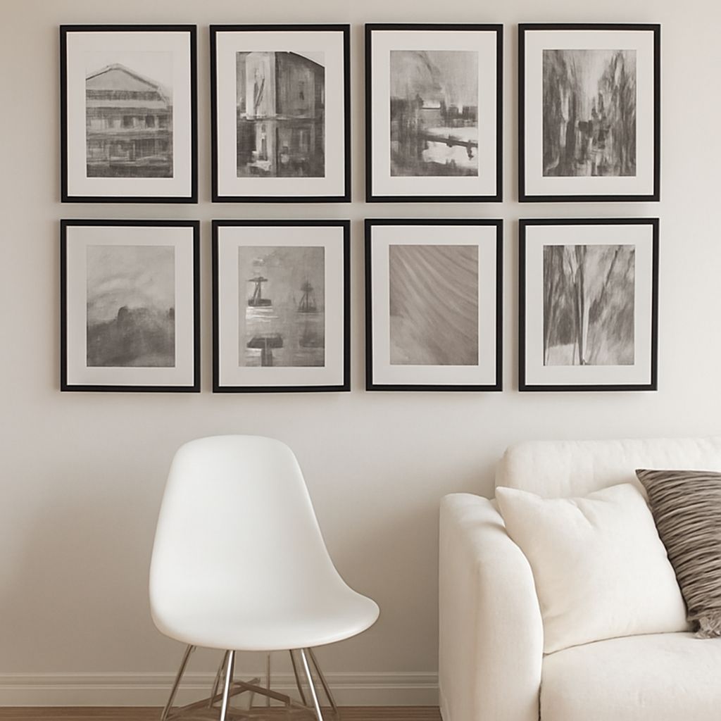
Framing Options for Black and White Artwork
Choosing Frame Color and Material
Black and white framed art looks sharp in several frame colors. A thin black metal frame keeps the focus on the image and suits modern or industrial interiors. A natural wood frame in light oak or walnut adds warmth and works well in Scandinavian or mid-century spaces. Avoid ornate gold frames unless your decor is explicitly traditional.
For a cohesive gallery wall, stick to one or two frame styles. Mixing five different frame materials across ten prints makes a wall look collected, not curated. If you want variety, vary the frame width rather than the finish.
Mat Width and Its Effect
A white or off-white mat of 2 to 3 inches gives each black and white art print visual breathing room. Wider mats make smaller prints feel more substantial and museum-quality. Skip colored mats unless you want to introduce an accent tone into the room.
Styling and Hanging Your Prints
When hanging a single anchor piece, center it at eye level, roughly 57 to 60 inches from the floor to the middle of the print. For a gallery wall, map the arrangement on paper before driving any nails. Space prints 2 to 3 inches apart for a tight, editorial look or 4 to 6 inches apart for a more relaxed feel.
Mix print sizes intentionally. A large anchor print on one side, balanced by two or three smaller ones on the other, creates the kind of asymmetrical balance that feels designed. Your black and white artwork collection doesn’t need to match in subject; it just needs tonal consistency.
Layer prints with plants, shelves, or mirrors to add depth. A trailing plant at the base of a gallery wall softens the edges and stops the arrangement from feeling flat.
Bottom line: Black and white prints work in almost any room because their tonal range complements rather than competes with existing colors. Choose a frame style you can repeat, hang at consistent eye level, and let the contrast of each black and white art print carry the visual weight.