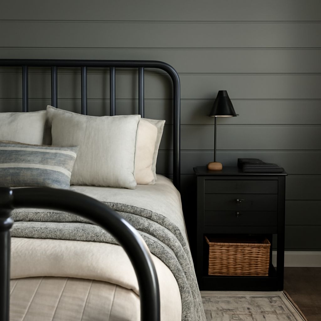
A white wall can look creamy beside an oak bed in morning sun and distinctly gray under a lamp at night. Choosing colors for the primary bedroom starts with that change in light and with the objects already in the room. The most appealing bedroom paint ideas connect the walls to the bedding, furniture and hours when the room is actually used.
A screen is useful for collecting possibilities, but its brightness and color settings cannot reproduce the light falling on a wall. Bring a shortlist home before buying enough paint for the entire space. Master bedroom paint colors deserve a comparison in the room itself. A small comparison can reveal whether a seemingly quiet neutral turns pink beside a rug or whether a favorite blue feels too cold at bedtime.
Bedroom Paint Colors, Ideas and Sample Tests
Start with the largest things that will stay: a wood bed frame, upholstered headboard, floor, rug and curtains. Lay a white sheet of paper beside each one to make its underlying tint easier to see. Oak may read golden, walnut brown-red, and a gray textile may lean blue or violet. These subtle biases are called undertones. Compare similar colors side by side.
Bedroom paint colors, ideas for bedding, and lighting choices should be considered together. A warm ivory wall can make a cream duvet look intentional, while a stark blue-white wall may make the same fabric appear yellow. That contrast can be attractive, but it deserves a deliberate look. Take a pillowcase or curtain sample to the paint store and compare it with several chips in daylight.
The best primary bedroom wall colors also suit the room’s exposure. North-facing light often makes cool undertones more noticeable; a south-facing room receives warmer light for much of the day. East-facing rooms change from brighter morning light to quieter afternoon light, while west-facing rooms can become especially warm late in the day. Trees, neighboring buildings and window coverings alter those patterns. Sherwin-Williams explains how orientation affects the appearance of color.
For a calm, light room with honey-colored wood, consider warm ivory walls, soft white trim, oatmeal linen and a muted olive throw. The olive gives the eye a point of contrast without competing with the wood. Choose an ivory with a trace of yellow or beige, then compare it with the floor: if the wall makes the wood look orange, try an ivory with less yellow. A woven natural-fiber rug and dark bronze lamp bases add definition to the pale scheme.
For a cooler, restful look, pair a muted blue-gray wall with crisp white bedding, charcoal accents and medium walnut furniture. Keep the blue slightly grayed rather than highly saturated if a quiet atmosphere is the aim. A pale blue can look much stronger across four walls than on a small chip. In a shaded room, test a warmer gray-blue alongside it; the warmer option may preserve the blue character without making the space feel chilly.
A muted sage wall gives a room with white oak furniture and off-white bedding a different emphasis. Add a rust or clay cushion and a small amount of black in a picture frame or reading lamp. Sage bridges warm wood and cooler white fabric, while the rust accent keeps the palette from becoming flat. If the bedding has a pink cast, compare it directly against the green: the pairing may make both colors appear more pronounced.
For a cocooning room, try a deep charcoal with a brown undertone, warm white bedding, walnut and aged brass. Paint all four walls for an enveloping effect, or use the dark color behind the bed and a related lighter neutral elsewhere. The accent-wall approach works best when the bed anchors that wall; a wall interrupted by several doors may feel less settled. Light linen curtains and a substantial pale rug can give the darker surfaces room to breathe.
A bedroom color for a primary suite can also be built around a patterned textile. Select one restrained color from the rug or duvet for the walls, then repeat a deeper version in a cushion or artwork. If the print combines terracotta, cream and dusty blue, a pale warm beige wall lets the pattern lead; a muted blue wall gives the room a cooler character. Keep a large item, such as the headboard, relatively quiet so the pattern and wall do not compete for attention.
Compare the Room, Not Just the Chip
Paint colors for the master bedroom can be narrowed to a short list. Gather two or three bedroom color ideas that differ in a meaningful way: perhaps a warm ivory, a pale greige and a soft sage. Greige is a gray-beige blend; some versions lean distinctly pink, green or violet. Put the chips next to the trim and bedding, then remove any option that makes a fixed material look unpleasant. A small chip is a filter for the shortlist, not the final verdict.
For a realistic test, imagine a north-facing room with a honey-oak bed, cream curtains and white bedding. Compare a warm ivory with a light gray-blue. In the morning, the ivory may make the oak and curtains feel connected; the blue may sharpen the contrast around the bed. At night, switch on the actual bedside lamps. If the ivory becomes too yellow, choose a less golden version. If the blue turns steely, try a grayer, warmer blue or keep it for a cushion instead.
Use movable white boards or large peel-and-stick samples, placing each against the wall near the bed and again beside the window. Benjamin Moore recommends moving samples around the room to judge them in different light. Leave space between candidates so their colors do not unduly influence one another. View each next to the trim and textiles in morning, afternoon and lamplight; photograph the boards as a record, while making the final judgment in person.
Finish also changes the impression. A matte or low-sheen finish gives a softer appearance and can make minor wall irregularities less conspicuous; a higher sheen reflects more light and can emphasize surface texture. Ask the paint retailer about the washability of the specific product, and compare finish samples when available. Paint ideas for a bedroom should account for the surface as well as the hue.
The primary bedroom’s wall color should support the way the room is used. For a bright, easygoing backdrop, choose the warm ivory sample and repeat its warmth in linen and wood. For a quieter, more defined setting, choose the gray-blue sample and balance it with cream textiles. Live with both boards through an evening and a morning, then select the one that makes the existing furnishings look their best.